Auto Layout Basics - Part 2 (final)
Continuing with this course. It's been useful so far - have picked up good stuff about constraints. Now for the next part!
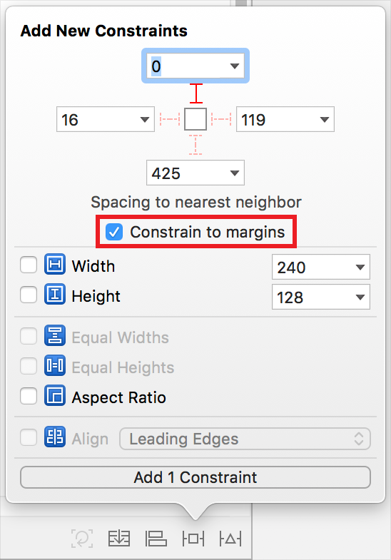
Layout Margins
These are shown by the dotted blue lines when you drag an object around the edges of the main screen view. Going to editor and 'show layout rectangles' - this shows all the margins. The margins are there to provide some white space on either side of the content. There's more information - about the layout margin distance, which you can edit on the options.
Superview - the red line.
Root view - this is the entire view of the View Controller and Safe view - the visible positions of the view. They cannot be blocked views (e.g. like navigation controller).
*Extra reading -
https://developer.apple.com/documentation/uikit/uiview/positioning_content_within_layout_margins
Layout margins provide a visual buffer between a view’s content and any content outside of the view’s bounds.
Here is the example from the link for how to set up the constraints.
Not sure about all of this yet - seems very complex.
directionalLayoutMargins
That is the property that you need to edit to change the margin layout values.
OK making more sense - basically the margin values can be extended/reduced to change the position of any content that is put on the screen.
Inequality Relationships
The purpose of this is to show constraints between two labels and the view - how these don't match up properly on every type of device. On the smaller ones, this is shown with the red lines:

The second label can only specify a very specific position due to the constraints - it can not adapt on smaller devices basically. The 252.5 constraint - not enough room!
So with changing the constraints, we want there to be minimum distance between the first and second labels. Greater than/less than equal relationships are needed.
Now we have changed the relationship to greater than or equal! It means that the space can grow up to that constant value (we have inputted 32) but not more.
Auto layout can make decisions on its own e.g. on the iPhone 4S device, the second label cannot be seen. So it is removed altogether from view.
INEQUALITY RELATIONSHIPS - USING GREATER THAN OR EQUAL/LESS THAN OR EQUAL.
Constraint Priorities
On the priority option (currently set to 1000), we can make one of the constraints optional. 1000 means the constraint is required. Anything less than 1000 means it is optional.
If an optional constraint cannot be satisfied, the system skips it and moves on to the next one.
Don't pick random values though! There is a gradual scale for this. 750 means it is optional but still important.
*Extra Reading -
https://developer.apple.com/library/archive/documentation/UserExperience/Conceptual/AutolayoutPG/AnatomyofaConstraint.html#//apple_ref/doc/uid/TP40010853-CH9-SW19
OK, all of that made sense. Basically, Xcode priorities if a certain condition of constraint cannot be met. It will skip, skipping the lowest priority value, then move on to the next one until all are checked.
Intrinsic Content Size, Content Hugging and Compression Resistance
AL can determine the position and size - even though we technically need to have four constraints.
Intrinsic content size... this will determine the size the view NEEDS to be, so we only need to worry about the position. There are some tricky aspects when relying on the intrinsic content size...
Leading - LEFT!
*Something I've noticed before and is very stark now is that my version of Xcode (9.4.1) auto resizes based on the length of the label - neat! This must be that I have a newer version than the one Pasan uses for the tutorials.*
Making the labels bigger than there is room means that the label positions change. Another constraint needed!
Trailing - RIGHT!
Basically, we need to decide which content is more important than the other. You can truncate the text in the label.
Content Hugging Priority - How much the view is drawn in by the content
Compression resistance - the force pulling outwards, so it fits in as much as possible
These are opposing forces.
Hugging - not wanting to grow; resistance - not wanting to shrink!
Extra Reading:
https://developer.apple.com/library/archive/documentation/UserExperience/Conceptual/AutolayoutPG/AnatomyofaConstraint.html#//apple_ref/doc/uid/TP40010853-CH9-SW1

This is something Pasan referred to. In our example, we've been looking at labels - do this is why we do not need to declare the height and width specifically as they have intrinsic content size applied to them. So depending on the type of view, it will depend on how much of the content size will be set intrinsically.

This diagram is just to show the content compression (outward/not wanting to shrink) vs content hugging (inward/not wanting to grow!).
Stack Views
Embed in stack - second option at bottom along left. They now have constraints added to them. Pinned to the edges of the stack view with no offsets. Stack view uses intrinsic content sizes for all stack views. However with no gap - this doesn't look like we would ever use it!

This is now how the buttons are represented, rather than as the horizontal way.


*OK Leading is left/up; Trailing is right/down!
Distribution in Stack Views
Alignment is perpendicular to the axis
Distribution is along the axis
All of this is REALLY useful - I'm not making many notes as soaking it all in and changing the views along with Pasan. It would have been perfect for the F1FunFacts, especially when I wanted three buttons!
SPACING - distance in points between edges of the adjacent views in the stack views.
So a new lesson - ALWAYS START with stack views!
So, a useful course/workshop. Lots of useful tidbits picked up here - thanks Pasan! It's great to get some more hands on experience with Xcode, this time focusing just on the layout, rather than any code per se. Only one more workshop to go, then that's it with Treehouse - for now at least!
Layout Margins
These are shown by the dotted blue lines when you drag an object around the edges of the main screen view. Going to editor and 'show layout rectangles' - this shows all the margins. The margins are there to provide some white space on either side of the content. There's more information - about the layout margin distance, which you can edit on the options.
Superview - the red line.
Root view - this is the entire view of the View Controller and Safe view - the visible positions of the view. They cannot be blocked views (e.g. like navigation controller).
*Extra reading -
https://developer.apple.com/documentation/uikit/uiview/positioning_content_within_layout_margins
Layout margins provide a visual buffer between a view’s content and any content outside of the view’s bounds.
Here is the example from the link for how to set up the constraints.
Not sure about all of this yet - seems very complex.
directionalLayoutMargins
That is the property that you need to edit to change the margin layout values.
OK making more sense - basically the margin values can be extended/reduced to change the position of any content that is put on the screen.
Inequality Relationships
The purpose of this is to show constraints between two labels and the view - how these don't match up properly on every type of device. On the smaller ones, this is shown with the red lines:
The second label can only specify a very specific position due to the constraints - it can not adapt on smaller devices basically. The 252.5 constraint - not enough room!
So with changing the constraints, we want there to be minimum distance between the first and second labels. Greater than/less than equal relationships are needed.
Now we have changed the relationship to greater than or equal! It means that the space can grow up to that constant value (we have inputted 32) but not more.
Auto layout can make decisions on its own e.g. on the iPhone 4S device, the second label cannot be seen. So it is removed altogether from view.
INEQUALITY RELATIONSHIPS - USING GREATER THAN OR EQUAL/LESS THAN OR EQUAL.
Constraint Priorities
On the priority option (currently set to 1000), we can make one of the constraints optional. 1000 means the constraint is required. Anything less than 1000 means it is optional.
If an optional constraint cannot be satisfied, the system skips it and moves on to the next one.
Don't pick random values though! There is a gradual scale for this. 750 means it is optional but still important.
*Extra Reading -
https://developer.apple.com/library/archive/documentation/UserExperience/Conceptual/AutolayoutPG/AnatomyofaConstraint.html#//apple_ref/doc/uid/TP40010853-CH9-SW19
OK, all of that made sense. Basically, Xcode priorities if a certain condition of constraint cannot be met. It will skip, skipping the lowest priority value, then move on to the next one until all are checked.
Intrinsic Content Size, Content Hugging and Compression Resistance
AL can determine the position and size - even though we technically need to have four constraints.
Intrinsic content size... this will determine the size the view NEEDS to be, so we only need to worry about the position. There are some tricky aspects when relying on the intrinsic content size...
Leading - LEFT!
*Something I've noticed before and is very stark now is that my version of Xcode (9.4.1) auto resizes based on the length of the label - neat! This must be that I have a newer version than the one Pasan uses for the tutorials.*
Making the labels bigger than there is room means that the label positions change. Another constraint needed!
Trailing - RIGHT!
Basically, we need to decide which content is more important than the other. You can truncate the text in the label.
Content Hugging Priority - How much the view is drawn in by the content
Compression resistance - the force pulling outwards, so it fits in as much as possible
These are opposing forces.
Hugging - not wanting to grow; resistance - not wanting to shrink!
Extra Reading:
https://developer.apple.com/library/archive/documentation/UserExperience/Conceptual/AutolayoutPG/AnatomyofaConstraint.html#//apple_ref/doc/uid/TP40010853-CH9-SW1
This is something Pasan referred to. In our example, we've been looking at labels - do this is why we do not need to declare the height and width specifically as they have intrinsic content size applied to them. So depending on the type of view, it will depend on how much of the content size will be set intrinsically.
This diagram is just to show the content compression (outward/not wanting to shrink) vs content hugging (inward/not wanting to grow!).
Stack Views
Embed in stack - second option at bottom along left. They now have constraints added to them. Pinned to the edges of the stack view with no offsets. Stack view uses intrinsic content sizes for all stack views. However with no gap - this doesn't look like we would ever use it!
This is now how the buttons are represented, rather than as the horizontal way.
*OK Leading is left/up; Trailing is right/down!
Distribution in Stack Views
Alignment is perpendicular to the axis
Distribution is along the axis
All of this is REALLY useful - I'm not making many notes as soaking it all in and changing the views along with Pasan. It would have been perfect for the F1FunFacts, especially when I wanted three buttons!
SPACING - distance in points between edges of the adjacent views in the stack views.
So a new lesson - ALWAYS START with stack views!
So, a useful course/workshop. Lots of useful tidbits picked up here - thanks Pasan! It's great to get some more hands on experience with Xcode, this time focusing just on the layout, rather than any code per se. Only one more workshop to go, then that's it with Treehouse - for now at least!

Comments
Post a Comment